Identity Design (3)


AAMI Park Stadium Typeface
AAMI Park Stadium is a uniquely shaped sports stadium and concert arena in Melbourne. Made up of spheres with triangle-shaped patterns there was plenty of inspiration for a typeface with a fun, playful personality. The typeface is inspired by the projection of a bouncing soccer ball linked to the idea of the stadium being the home of soccer in Melbourne. The diagram of the bounce was broken up into modules that make up the letters . Although not inspired by the building itself, the cloud-like shapes the letters form can be seen in the construction of the stadium.


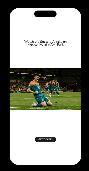
Image credits (in order of apperance)
FIFA/Chris Hyde
Melbourne Victory/Mikko Robles
Socceroos
AAMI PARK
FIFA/Alex Grimm
Getty Images
CV Media Signage


InTouch Identity
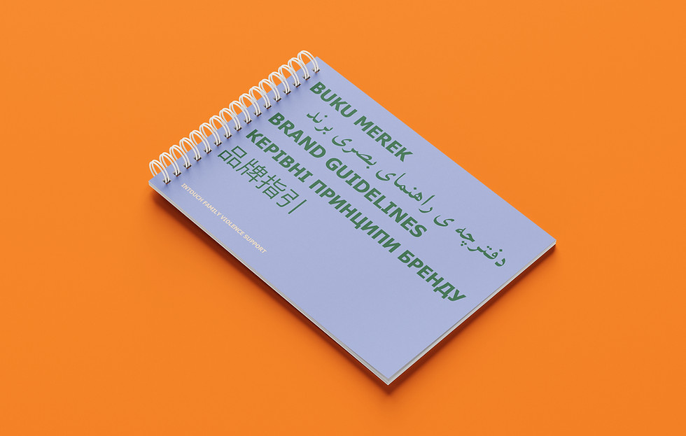
InTouch is a not-for-profit organisation that provides services, programs, and responses to family violence in migrant and refugee communities. This project aimed to rebrand the organisation's identity to better connect with its audience. The identity is all about feeling understood and less alone. Its about being inviting and creating a sense of hope and community. The Identity aims to celebrate language, one of InTouch’s key services with over 100 countries making up their client base. The logo represents the idea of connection and multiculturalism through the motif of the speech bubble which can also be interpreted as a flag. The broad colour palette was also a big part of the branding, ensuring the brand feels inviting rather than clinical. The imagery was also important and needed to depict the clients in a raw, authentic way to create relatability and a sense of community.
The Brand Audit was essential in understanding the client base and the struggles they were facing. It outlined issues such as accessibility, atmosphere and relatability which the rebrand focused on.




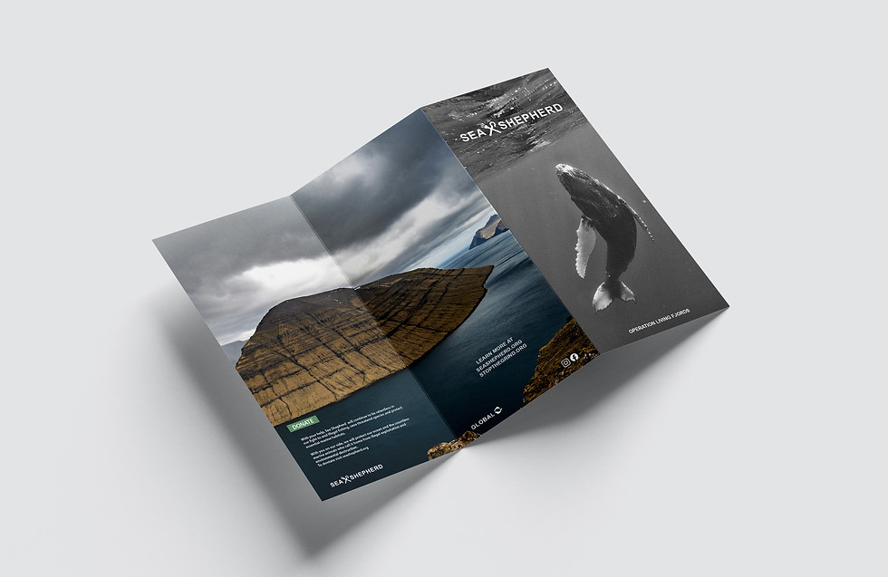
Sea Shepherd Identity
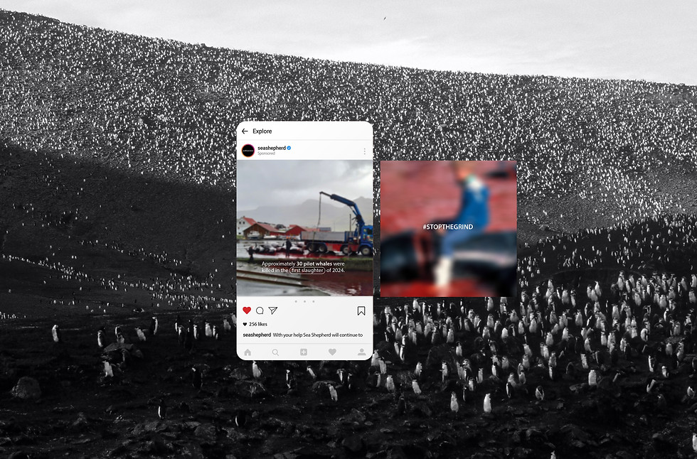
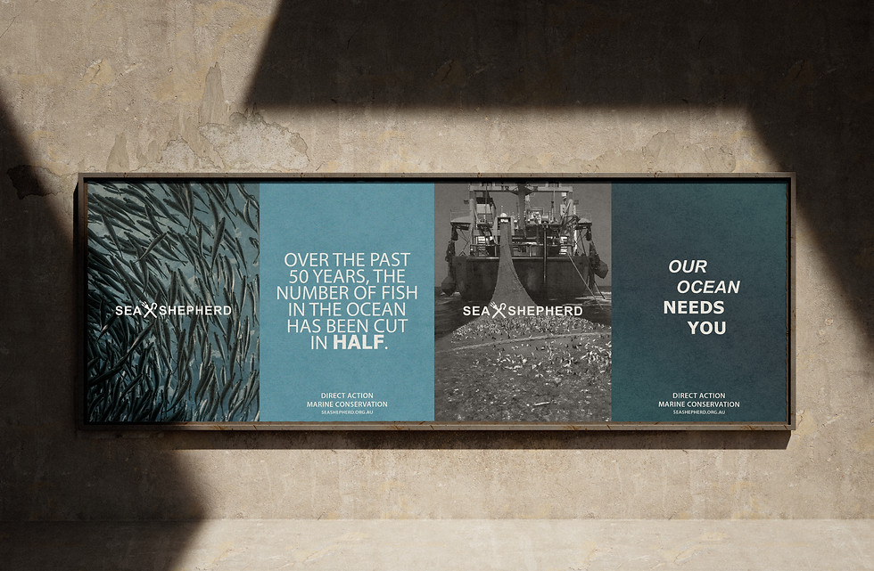
Sea Shepherd is a direct-action marine conservation organisation. This not-for-profit organisation is strong in its beliefs and works hard to protect our oceans. This rebrand focused on attracting a wider audience. The logo has been adapted from their well-known trademark with the aim to make it more inviting to a less radical audience. The branding is quite simple which lets the photography and copywriting do the talking. There is a strong juxtaposition between the photography styles; beautiful imagery of our oceans and the harsh reality of the impacts of modern day life on our oceans, some of these photos are blurred slightly as they are very confronting. This is a strong part of the Sea Shephard brand – being brutally honest, though this may be too intense for some.